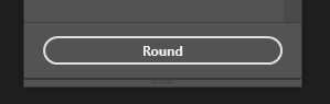
I’ve set up a very simple example:
It shows it all… Currently there’s no way to set a normal border radius for a dynamic height (height: auto) button (in this case it’s sp-action-button) to look like a pill (instead of ellipse). At least I couldn’t figure out how to
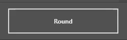
Exact same thing with <div/>
Any advice?
Hm, I’m still using divs as buttons:
.button {
  height: var(--buttonHeight);
  border-radius: calc(var(--buttonHeight) / 2);
}
Should be latest PS (and has never been an issue in the past)
But you see, you have here a specific height that you know about. I have height: auto and I can’t really change that
Your best bet would be reading the height via JS then, I think.
Unfortunately it seems like UXP has a different way of calculating roundings above the “height/2-mark”:
JS also isn’t a good option if I want to keep plugin performant. For now I’m just not implementing the feature. If users will ask for it, I’ll just redirect them to Adobe  Don’t see another viable choice right now
What feature are you trying to implement? Unless the button resizes constantly, I don’t see any performance issue
There can be any number of buttons (users can add as they wish). Also currently I don’t have any DOM (or CSS) manipulation via JS directly - all is rendered depending on React state and I’d like to keep it that way
I’d just build a component for that type of button which deals with reading the height (which is a bit more tricky in UXP due to different render frames than in a normal browser):
const RoundedButton: React.FC = () => {
  const ref = useRef<HTMLDivElement>()
  const [height, setHeight] = useState<number>()
  const onResize = useCallback(() => setHeight(ref.current.clientHeight), [])
  useEffect(() => {
    if(ref.current) { ref.current.addEventListener("resize", onResize) }
    return () => ref.current.removeEventListener("resize", onResize)
  } , [ref.current])

  return(
    <div ref={ref} className="button" style={{...(height ? {borderRadius: height / 2} : {visibility: 'hidden'})}}>
      Rounded Button
    </div>
  )
}
Resulting in (with randomly assigned heights, for demo):
Also shouldn’t flicker due to the visibility:hidden until the height could be read
Hmm… Looks like a more or less reasonable workaround. Will look at it some other evening later in the week (busy week ahead). And today I just submitted updates to the Marketplace and feeling tired, so will rest  Will let you know how it goes
But anyway, IMO Adobe should still fix this to be properly rendered with pure CSS without such hacks
Yep, I agree - if anyone would still want the oval look (not sure why anyone would want this), they could just use %-based radius.
Apparently it won’t work 
For the button itself solution works, but I also have custom borders, which has to be set with ::after and position: absolute (currently there’s no other way). So I found changing such borders with JS could be done by adding attribute to a button (eg. data-border-radius="23") and in CSS - button::after {border-radius: attr(data-border-radius px, 0)} (zero as a fallback). It seems UXP doesn’t support CSS attr() either (tried directly on button also, but no change; will post a feature request)
At least I found out about React.forwardRef() 
Can you show an example of the intended result? (or the code for the custom border)
I don’t see a reason yet why it shouldn’t work if you have the buttons actual height - any other needed CSS can be derived from that, can’t it?
At least I found out about React.forwardRef()
I absolutely hate React.forwardRef(), it’s just so bad if you’re using TypeScript. With plain JS it’s okay I assume, but for me simply passing a ref as prop has always been the easier way.
CSS:
sp-action-button:after {
    content: "";
    position: absolute;
    top: -1px;
    right: -1px;
    bottom: -1px;
    left: -1px;
    border-width: 1px;
    border-radius: 25px;
    border-style: solid;
    border-bottom-color: red;
}

sp-action-button {
   width: 100px;
   height: 50px;
   margin: 10px;
   padding: 5px 10px;
   border-radius: 25px;
   background-color: green;
   border-width: 1px;
   border-top-color: purple;
}
HTML
<sp-action-button>Label</sp-action-button>
This is the intended result. As you will see, there’s no way to change single border directly on a button, but you can do it using ::after workaround, but I couldn’t find a way to change ::after element with JS, apart of mentioned approach with CSS attr()
I tried that, but it didn’t work. I got the error in console asking if I intended to use forwardRef() - that’s why I had to look for it  Now I’m thinking it could be because I used same name
 ref to pass it… Will try different name (eg. refElement) next time and see if I get same error
Which style of the ::after element do you need to change? If it’s just the border-radius, you could use border-radius: inherit or not? That will give it the same as its parent (the button), which seems like what you were trying to do with attr(). Support for attr() is quite bad already on browsers, so I wouldn’t expect it to work in UXP. Another way to derive multiple styles based on one specific style would be to use custom CSS properties (variables), so that you can reuse them or even use them in calc().
Yes exactly, that’s the only drawback of passing refs via props since ref is used by React. That has never been an issue for me, quite the opposite, it forces you do properly name what that refs points to.
Screw this… I’m really mad. UXP UI is so half baked - it drives me crazy…
My CSS:
  sp-action-button {
    --border-radius: var(--button-border-radius, var(--layout-border-radius, 0.25em));

    position: relative;
    border-radius: var(--border-radius);

    &::after {
      content: '';
      position: absolute;
      top: -1px;
      right: -1px;
      bottom: -1px;
      left: -1px;
      border-width: 1px;
      border-style: solid;
      border-radius: inherit;
      pointer-events: none;
    }
  }
As UDT Dev Tools doesn’t show pseudo elements (neither in Elements nor in Styles), there’s no way to properly debug and I think 2 days spent on this is enough.
Basically what happens, it never re-renders borders. Borders ger re-rendered only when I disable (and re-enable) sp-action-button {--border-radius: ... variable in Dev Tools. Otherwise it just doesn’t work… Just tried changing cursor:default I have on ::root and it also re-renders borders correctly after that…
Your particular issue this time is running afoul of UXP trying to optimize the number of changes it has to send from JS to the native rendering layer – clearly border-radius: inherit for the ::after pseudo-element does not receive the notification of a border radius change when that change happens on its real element. (CC @Sujai , @pkrishna ← this sounds like a missing feature in UXP’s propagation of style changes).
That said, Spectrum UXP controls are not designed to be infinitely customizable. At this point, I really think you’re better off using a div (or any other tag name – you could have <my-pill-button> – it’ll be treated like a div) where you don’t need to fight with the borders that Spectrum UXP is trying to show.
I know that’s a lot of initial styling to make the button look decent and be theme-aware, but you’re going to run up against far fewer difficulties in the long run when you control all the styles and don’t have to rely on hacks like ::after to add borders to elements that really don’t want them… or should sp-action-button's appearance change in the future.
It’s the same on any element - on <div/> doesn’t work either
Edit: Wait… Did you mean the JS approach on <div/>? Now I think maybe I didn’t try this. Will check after work to be sure. But anyway, the normal CSS border-radius: 9999px should be fixed to be supported
Yep – meant the second option – you wouldn’t need an ::after element to apply borders, and so changing the border-radius on a div at runtime would accomplish the visual effect you’re looking after.
Don’t disagree on the issue w/ border radii being wrong when using px, but right now can only offer options that may result in less head-to-desk collisions.
Wonder if there’s any update on this one 
Any chance we would get the working border-radius: 50vh or should I just close the ticket for my plugin as “Won’t do”? 


