And that’s the problem. I don’t know what the smallest size will be when it’s language independent. And I should not have to worry about it.
It doesn’t even work in the kitchen sink example. And as I said. I don’t need anything special that is flex based. Just the vanilla HTML code should do the trick. And I’m not sure that Kerry’s example will be adaptive to the widest/narrowest item automatically. There’s are concrete values and calculations involved.
I want it fixed, but the text should define the width - not me.
Maybe just go without the label and build the label directly into the dropdown. Look at the original post and see how I did it in the Hot Folder UI. That should work for what you want. That was the compromise I made a few months back/. No users have complained about the layout yet… so that works for me 

No, look at the other example. I posted 2 examples. The one with the print units is from my Face Crop plugin and I don’t use that method anymore since 22.3. The other example shown on the bottom was from my Hot Folder plugin. I have since went to the method shown in my Hot Folder plugin for both. It does work. I have multiple plugins using that method. I just go without a label and build all of the text into the dropdown itself.
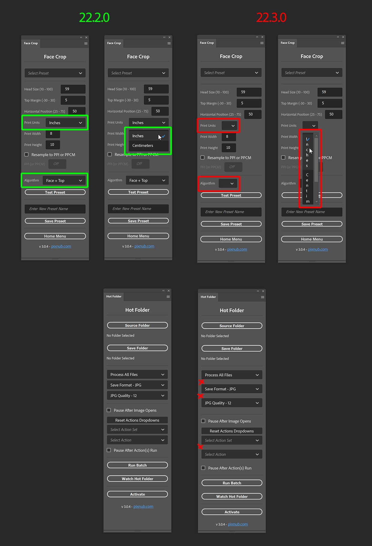
But in her screenshots there are no values longer than the set width of a select
A few quick notes before getting into an example.
- 22.4 has an issue where
sp-dropdowndoes not have a minimum width set by default. This causes unsightly behavior that you see now. 22.5 fixes this by assigning a default width (around 240px, although you can override this). - The other bug from 22.2 to 22.3 was that
display: flexto get inline labels no longer works. My reply was under the assumption that you were trying to get the same inline look in 22.4. The only way to make that work right now is to use some absolute positioning. - The flex in the example is there to make it easy for you to see how the widths change the popover width – not intended to solve the problem itself.
- Lastly, Spectrum Look and Feel is not HTML Look and Feel. Although a dropdown and a select are similar, there are differences.
A tale of two variants
sp-dropdown has two variations. One is the normal variant which is surrounded by borders. It looks like this:

This variant will naturally size the dropdown to the same width as the field itself. This will result in wrapped text, which is by design. See Picker - Spectrum.
The quiet version does not have this same limitation, but it does not draw a border around the field. (Also, it currently renders the dropdown center-aligned when it should be left-aligned.)

To keep the bottom line from wrapping, you can add sp-menu-item { white-space: nowrap; } and it’ll stick to one line (at the risk of being wider).
There is no third option in the Spectrum design language. Either the dropdown matches the field outlined with a border, or there’s no border and the dropdown is free to expand.
Workarounds
If you can live w/ the center positioning for now, you can make a quiet dropdown look like a loud one:

This is accomplished by adding some borders back – but you will have to worry about theming. The CSS I provide below is for the darkest theme only.
:root {
    --dropdown-border-color: #404040;
    --dropdown-border-color-hover: #525252;
    --dropdown-border-color-active: #076EDC;
    --dropdown-background-color: #191919;
    --dropdown-background-color-hover: #0A0A0A;
    --dropdown-background-color-active: #333333;
}
sp-dropdown[quiet].lookloud {
    border: 1px solid var(--dropdown-border-color);
    background-color: var(--dropdown-background-color);
    border-radius: 4px;
    padding: 0 8px;
    height: 32px;
}
sp-dropdown[quiet].lookloud:hover {
    border: 1px solid var(--dropdown-border-color-hover);
    background-color: var(--dropdown-background-color-hover);
}
sp-dropdown[quiet].lookloud:active {
    border: 1px solid var(--dropdown-border-color-active);
    background-color: var(--dropdown-background-color-active);
}
sp-dropdown[quiet].lookloud:focus {
    outline: 2px solid var(--dropdown-border-color-active);
    outline-radius: 6px;
}
sp-dropdown[quiet].lookloud sp-menu-item {
    white-space: nowrap;
}
Use it like so:
<sp-dropdown quiet class="lookloud" >...</sp-dropdown>
If you want yet more control, you’re going to need to delve into some JS and be on Ps 22.5 or better (currently in pre-release). For example:
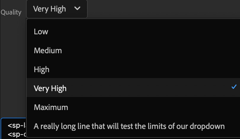
HTML:
<sp-label>Quality</sp-label>
<sp-overlay class="fakedropdown">
 <sp-action-button slot="trigger"><span class="value">High</span><sp-icon name="ui:ChevronDownMedium"></sp-icon></sp-action-button>
 <sp-popover placement="bottom" alignment="left" slot="click">
  <sp-menu>
   <sp-menu-item datakey="jpgquality_low">Low</sp-menu-item>
   <sp-menu-item datakey="jpgquality_medium">Medium</sp-menu-item>
   <sp-menu-item datakey="jpgquality_high">High</sp-menu-item>
   <sp-menu-item datakey="jpgquality_veryhigh" selected>Very High</sp-menu-item>
   <sp-menu-item datakey="jpgquality_maximum">Maximum</sp-menu-item>
   <sp-menu-item datakey="jpgquality_maximum">A really long line that will test the limits of our dropdown</sp-menu-item>
  </sp-menu>
 </sp-popover>
</sp-overlay>
CSS:
.fakedropdown sp-icon {
    margin-left: 1em;
}
.fakedropdown sp-menu { width: auto;}
.fakedropdown sp-menu-item {
    white-space: nowrap;
    padding: 0 28px 0 10px;
}
JS:
document.querySelectorAll(".fakedropdown sp-menu").forEach (el => {
  el.addEventListener("change",  event => {
    const target = event.target;
    const parentPopover = target.parentElement;
    const fieldValue = target.parentElement.previousElementSibling.firstElementChild;
    fieldValue.textContent = target.value;
    setTimeout( () => parentPopover.open = true, 20); /*bug; shouldn't need this*/
    setTimeout( () => parentPopover.open = false, 40);
  });
});
Thanks for the elaborate explanation. I have no clue what version of the API I’m using - I’m always using the latest one that I can download officially. So whatever I can use right now - that’s what counts. I also don’t know where to be informed about fixes of the API. Maybe you can tell me the link to that.
Introducing a “min-width” value is a workaround, but not a solution. I can set a min-width value now and it’s also just a workaround. Whether you call it a dropdown box or a select box, the premise is simple. Make it as wide as the widest element contained. That’s it. No “min-widthing”, “flexing” and hacking needed. And if you want to get anything special, you should be able to so, via CSS or Javascript if you are really adventurous.
So please. Fix the basic stuff like the dropdown/select box, the textfield and the multiple open dialog mess and things will be a lot easier and the code a lot cleaner.
When I’ve got a link where I can check if the updates are implemented, I will wait and see when I can proceed.
Cheers.
And one more thing, cause I read it in your post. Get rid of all those “absolute positioning” workarounds. This is like an alarm signal that something isn’t properly implemented. Absolute positioning has a purpose but it should not be to move labels and elements into positions where they should be automatically or via some attribute.
The Spectrum documentation looks so nice and well thought out but once you get to the Photoshop implementation, the situation is quite a different one. I wouldn’t mind if this was a beta project that people can use experimentally while being worked on, but once you start to deactivate CEP plugins and we have to use this API, things are getting problematic. Otherwise I wouldn’t care.